
Bento Design System
Designing beyond the component
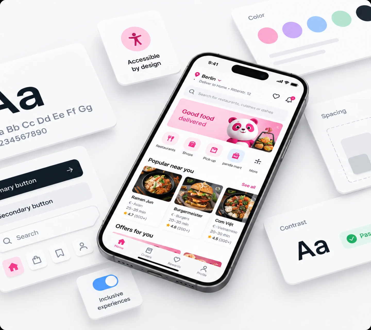
Once Bento’s foundations were clearer, the next challenge was making components do more than look consistent. They needed to encode behaviour, states, platform differences, motion, and accessibility in a way product teams could reuse.
Components needed to carry more than visual consistency
A reusable component wasn’t useful if teams still had to rediscover how it should behave in different states, on different platforms, or with assistive technologies.
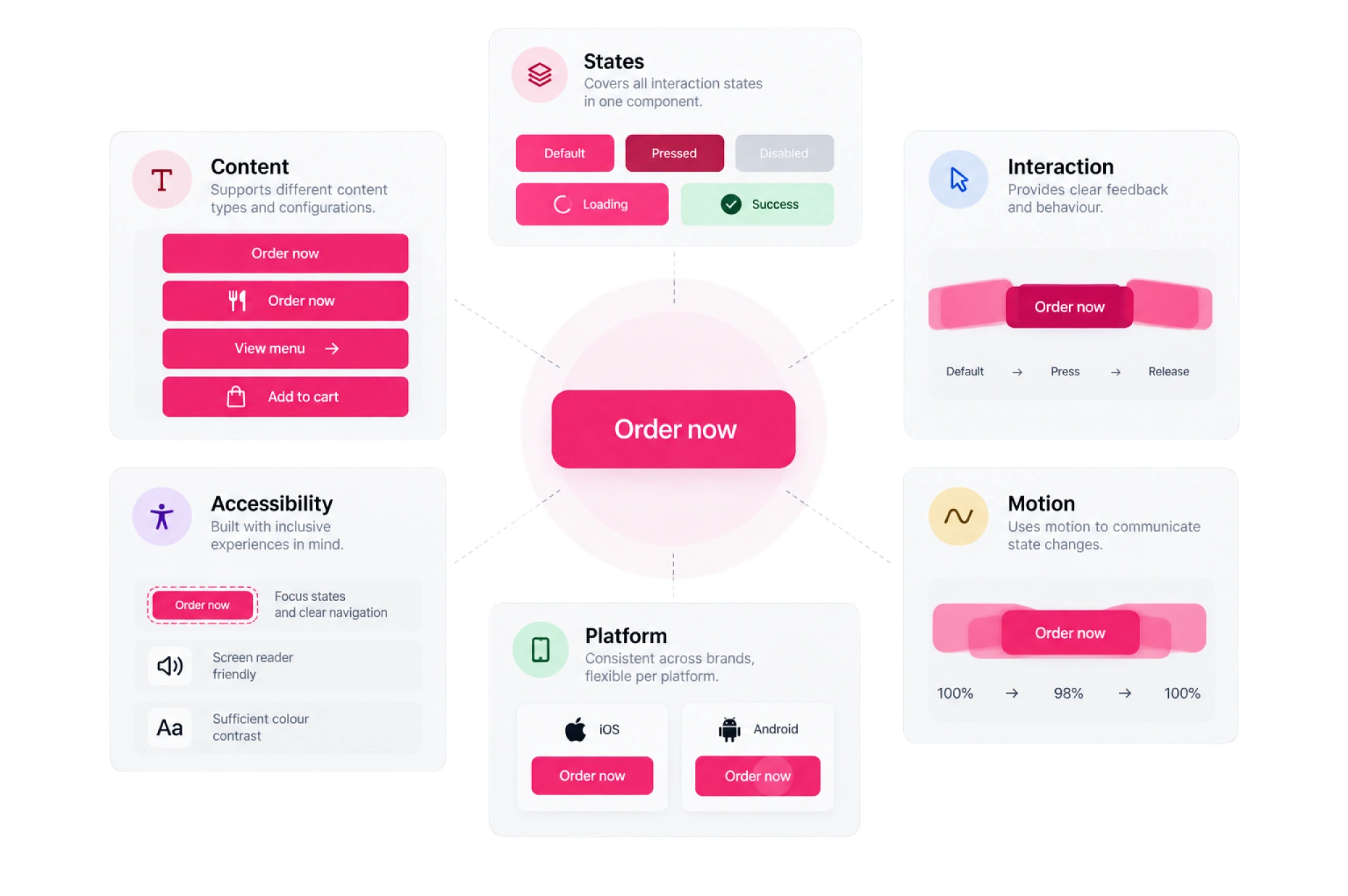
As Bento matured, component quality meant defining not only appearance, but also states, content variants, interaction, motion, platform behaviour, and accessibility.
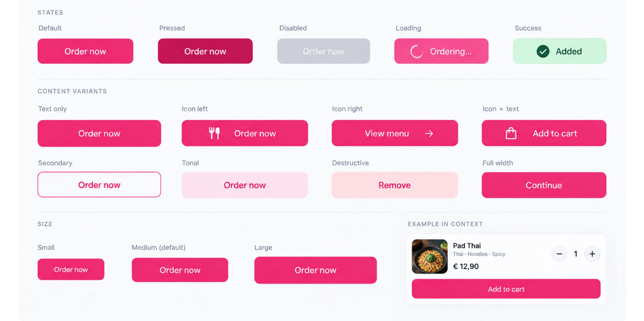
This is directly visible in the Bento Mobile library: the button documentation includes default, pressed, disabled, loading, and success states, multiple content configurations, motion specifications, gesture behaviour, platform differences, and accessibility guidance.
One component, multiple responsibilities
We treated components as systems rather than isolated pieces of UI.
The Button component, for example, brought together multiple content configurations and interaction states within one reusable structure including default, pressed, disabled, loading and success states.
This gave teams a clearer starting point while keeping the component flexible enough for different product contexts.
Accessibility became part of the specification
Accessibility wasn’t treated as a final QA step. It was documented alongside the component’s structure and behaviour.
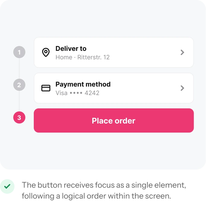
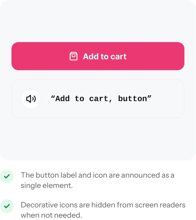
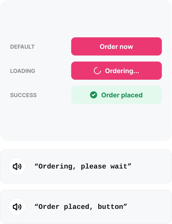
For buttons, this meant defining how the component received focus, how its content was announced by screen readers, and how changing states such as loading and success were communicated.
The goal was simple: when teams reused a Bento component, they inherited more of the thinking required to make it usable — not just its appearance.
01 — FOCUS ORDER
The button is treated as a single CTA in the focus order.
02 — SCREEN READER
Relevant content is announced together rather than as disconnected elements.
03 — STATE CHANGES
Loading and completion states have defined announcements.
Making behaviour predictable
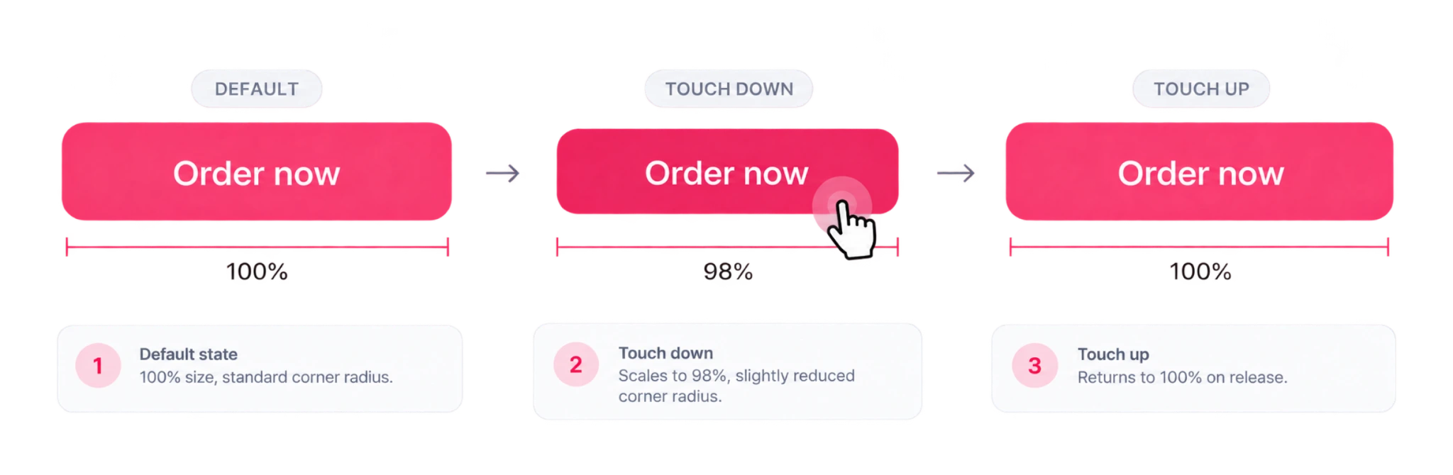
Interaction specifications defined what happened between static states.
For the primary Button, touch down feedback scales the component from 100% to 98%, before returning to its original size on release. The corner radius changes with the interaction, creating a subtle sense of response.
Motion was also used when values such as quantity or price changed, helping draw attention to information that had just been updated.
Shared intent, platform appropriate behaviour
Consistency didn’t mean forcing identical interactions onto every platform.
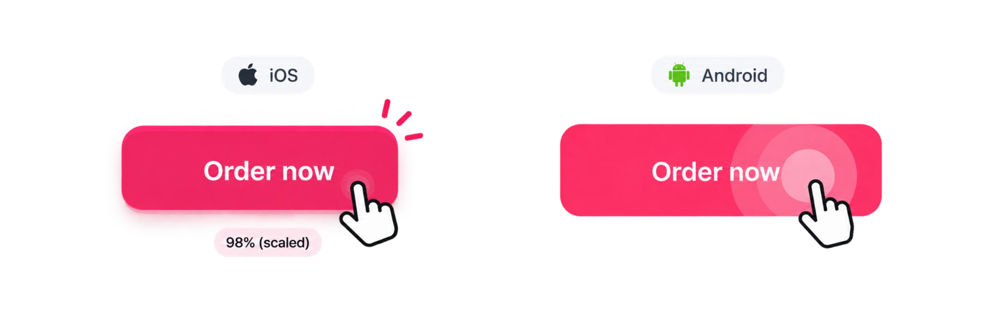
Bento documented the same interaction intent across iOS and Android while allowing each platform to use behaviour that felt native. Android, for example, used ripple feedback while maintaining the same underlying colour token logic.
The system provided shared rules without erasing platform conventions.
Better defaults, fewer repeated decisions
The component library became more than a collection of reusable UI.
It brought visual design, interaction, accessibility and platform behaviour into the same system — giving product teams stronger defaults and a clearer shared reference when building experiences.